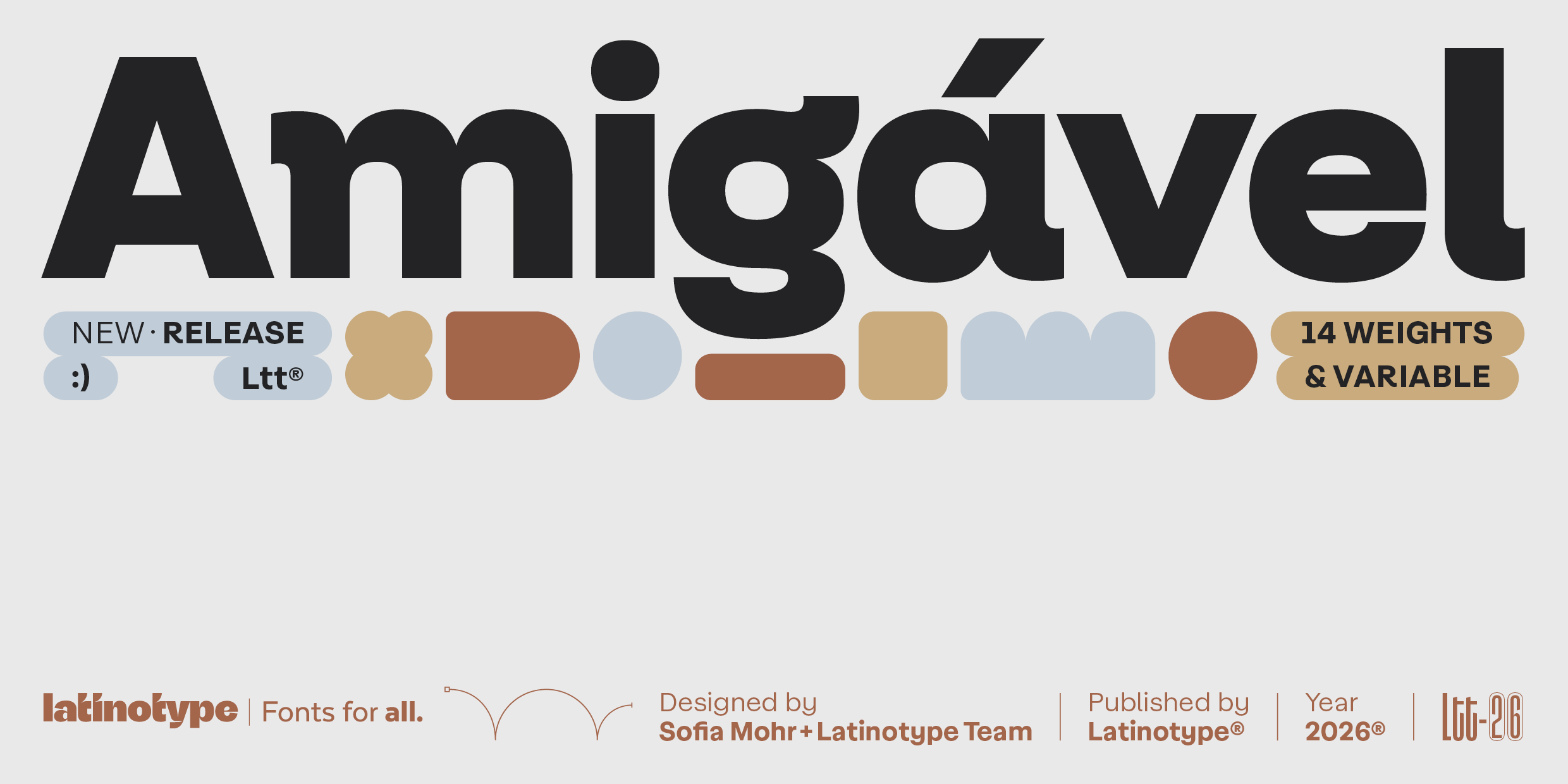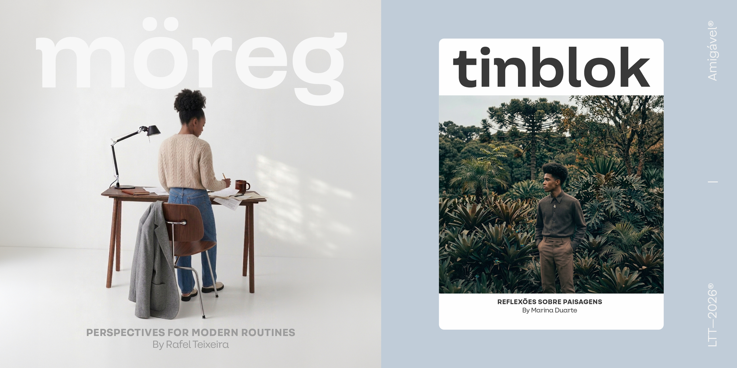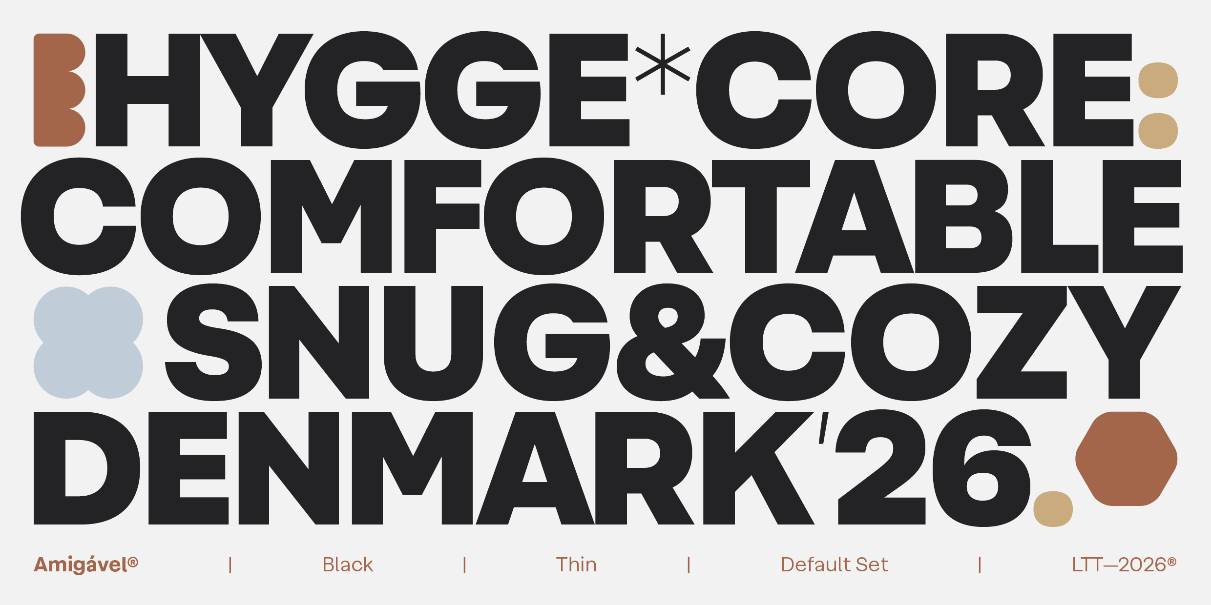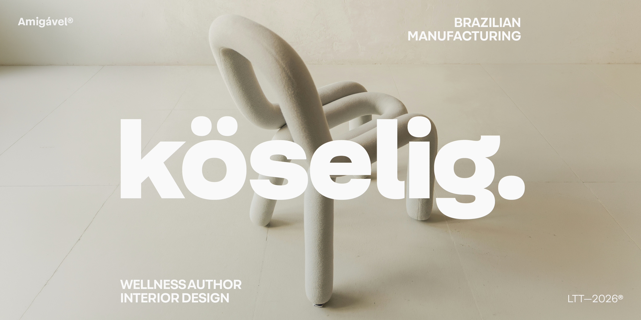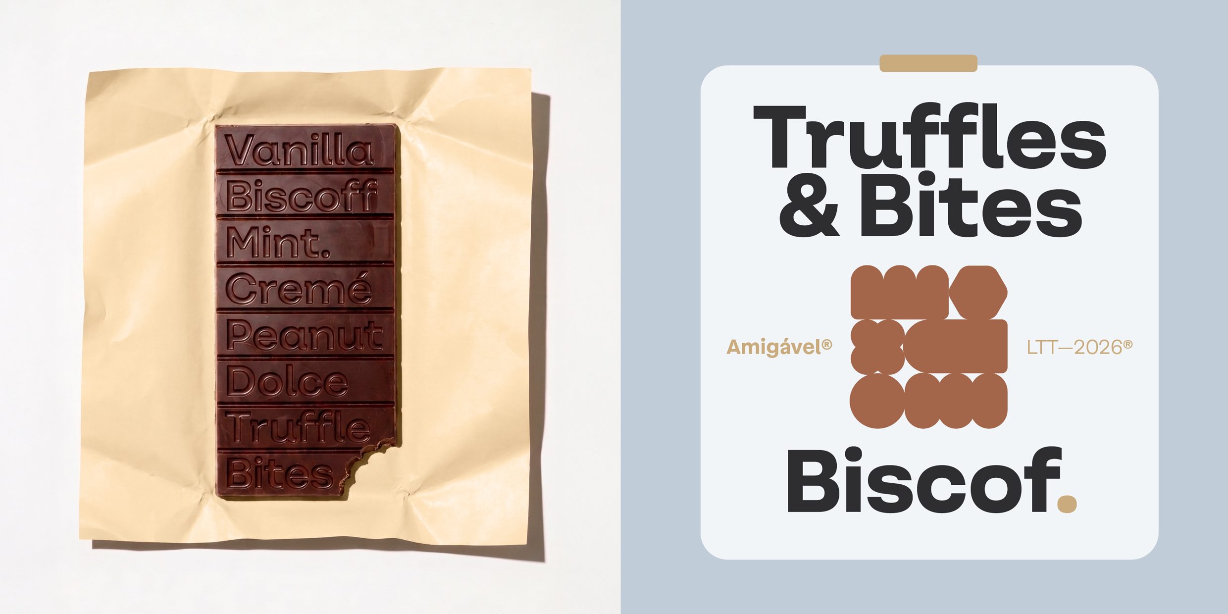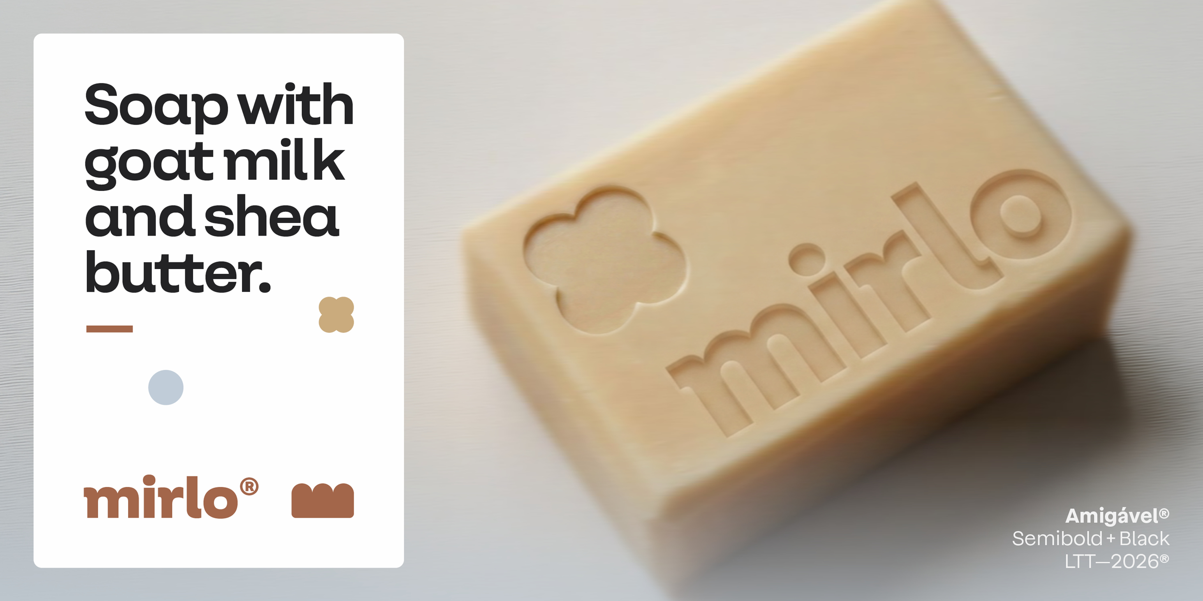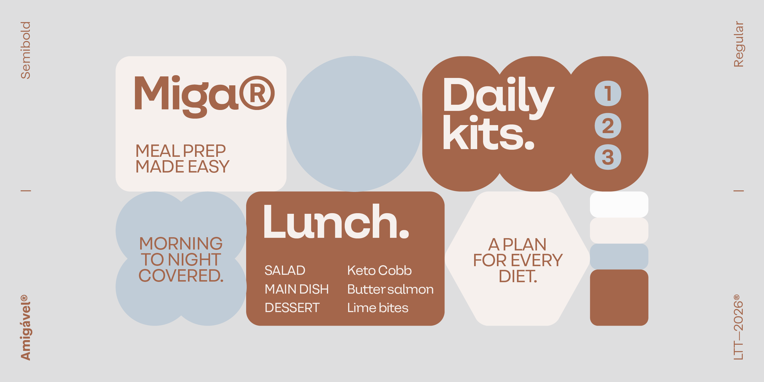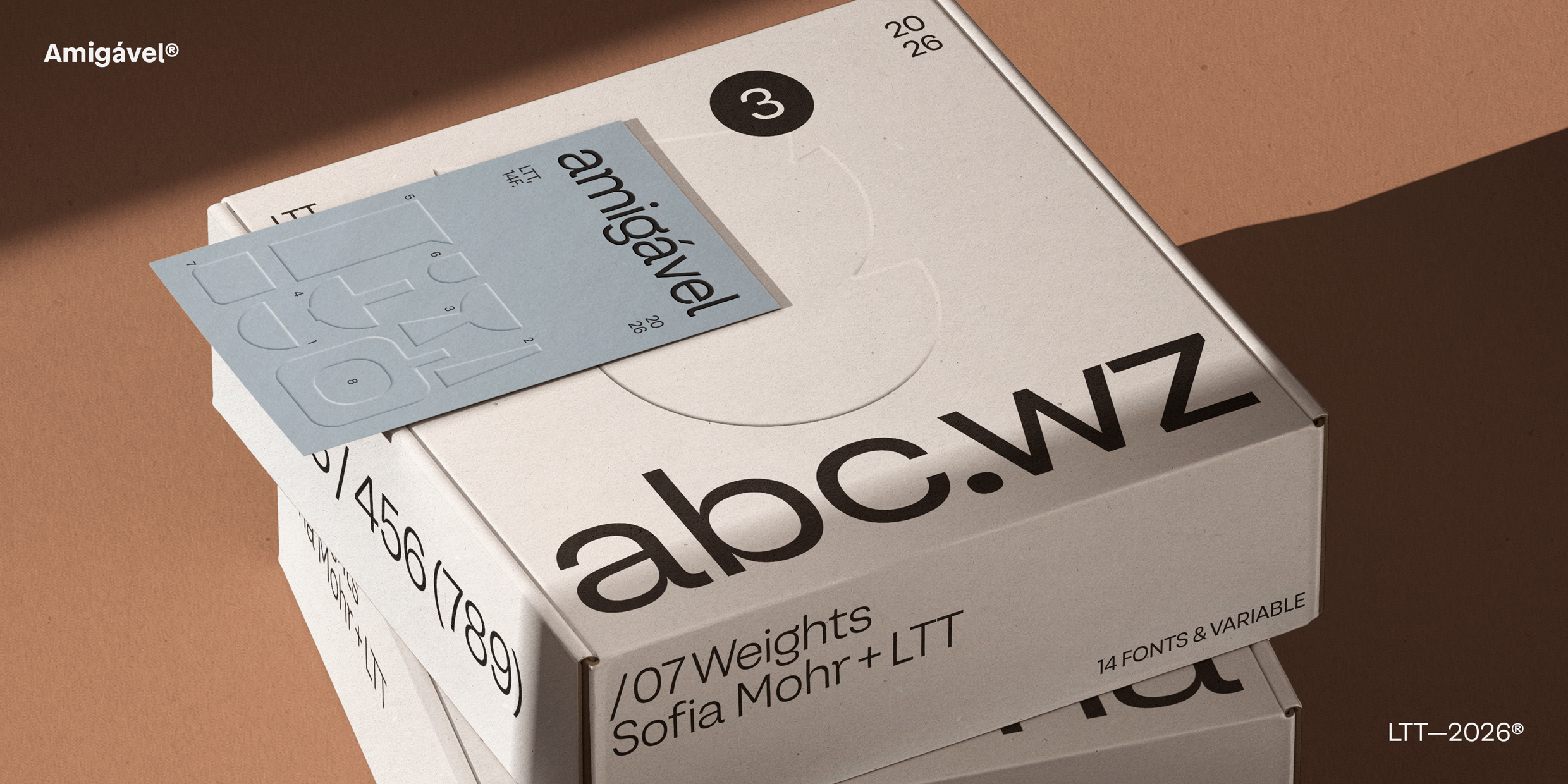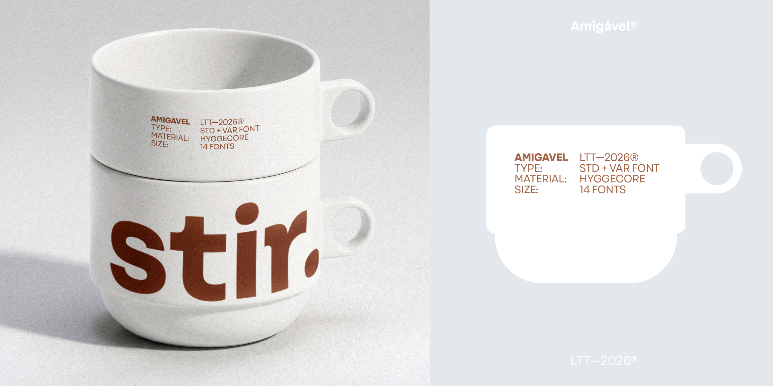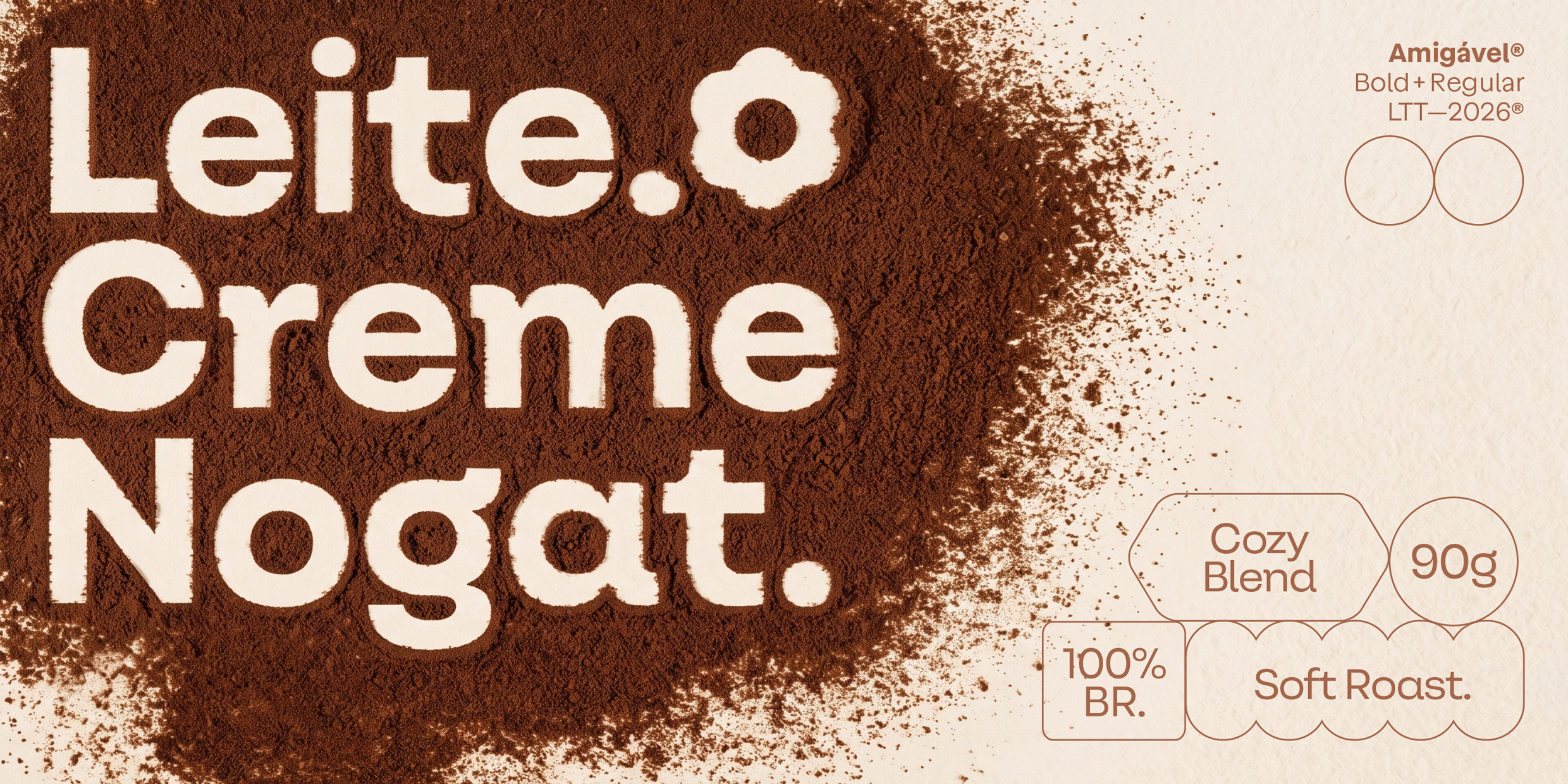
Amigável is a contemporary geometric sans designed to bring warmth, clarity, and confidence to everyday communication. Built on a precise geometric foundation, it balances structured forms with softened details, generous proportions, and subtle optical refinements, creating a voice that feels approachable, refined, and quietly distinctive.
Its clean, contemporary shapes give the family a confident architectural presence, while carefully crafted curves preserve the warmth and friendliness that inspired its name.
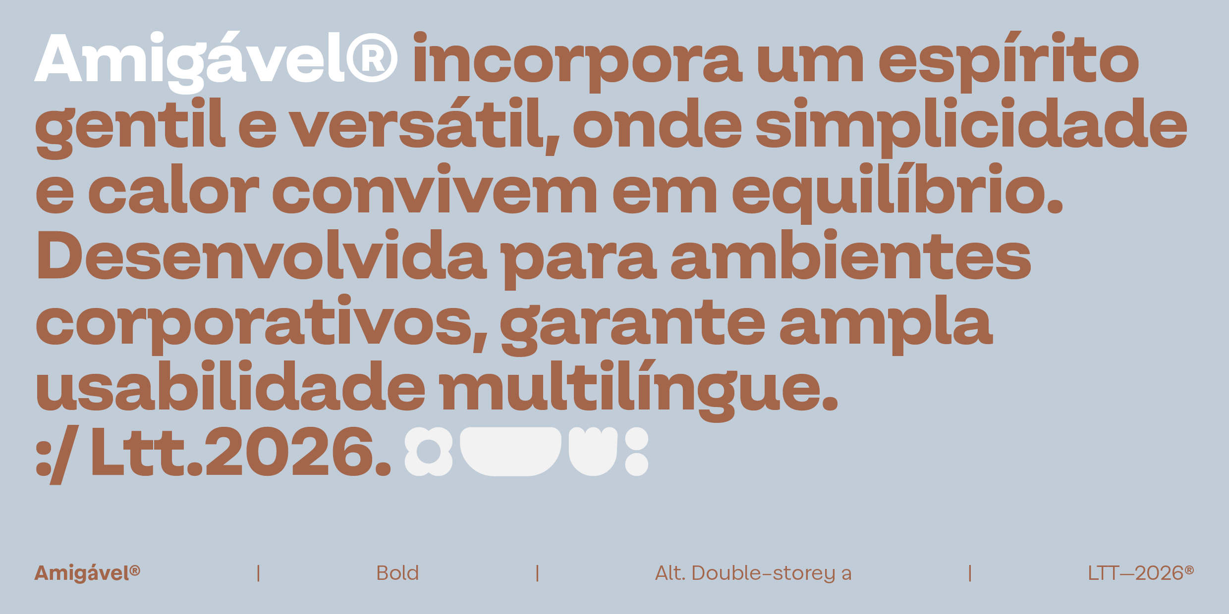
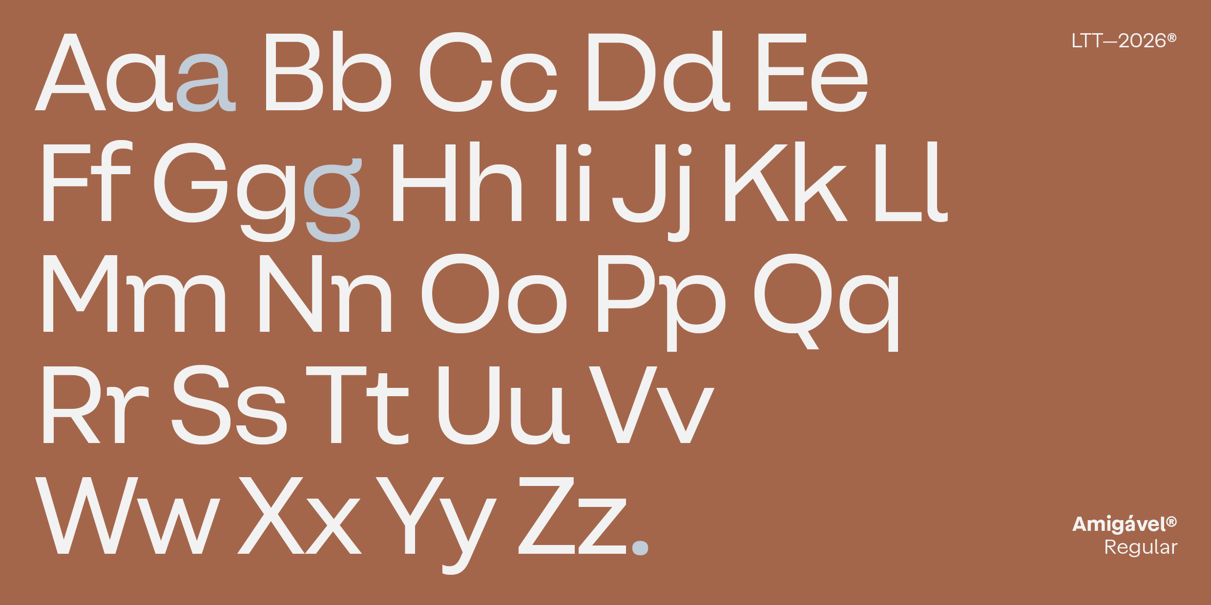
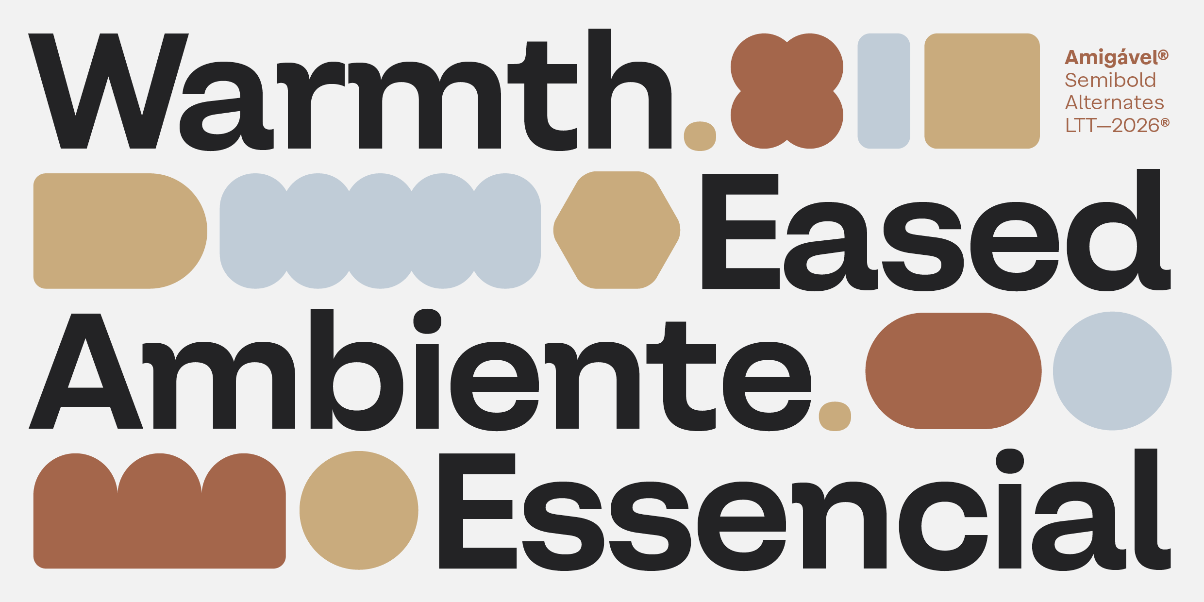
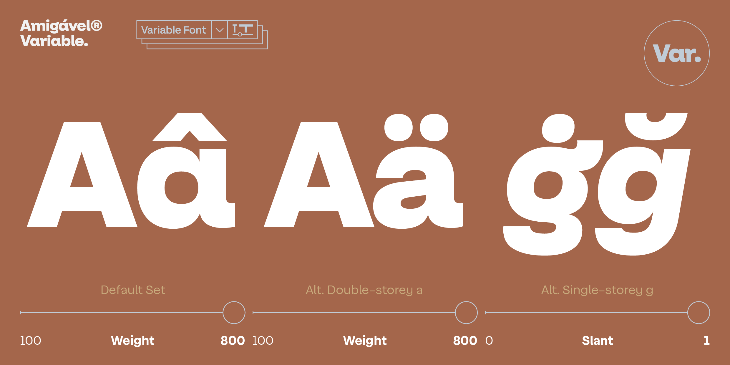
Stylistic alternates — including both single-storey and double-storey forms of a and g — allow designers to shift effortlessly between a more expressive personality and a more conventional tone depending on the project. A generous x-height, open counters, and low contrast ensure excellent readability across a wide range of sizes, from interface design and editorial layouts to branding, packaging, signage, and digital products.
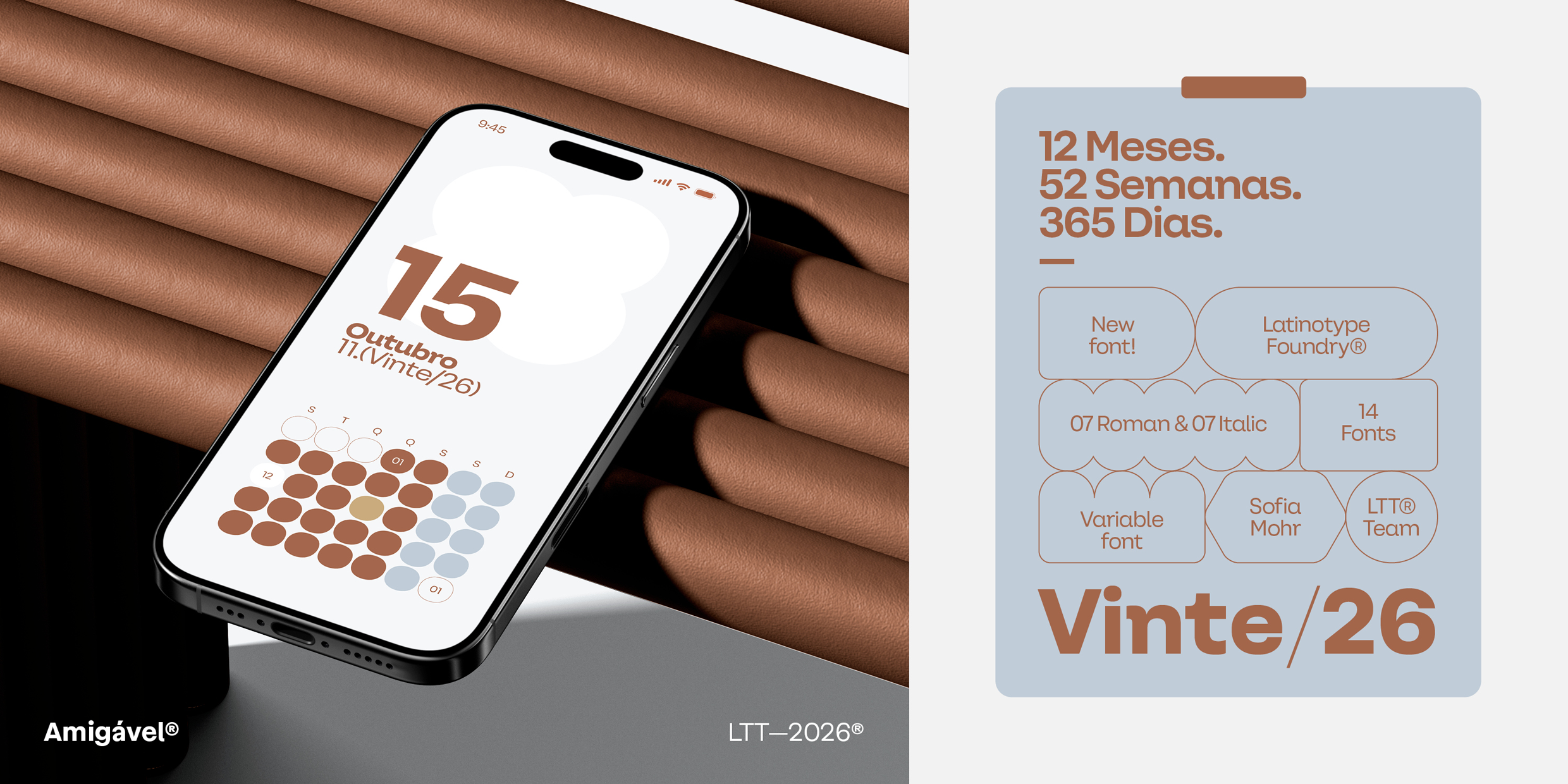
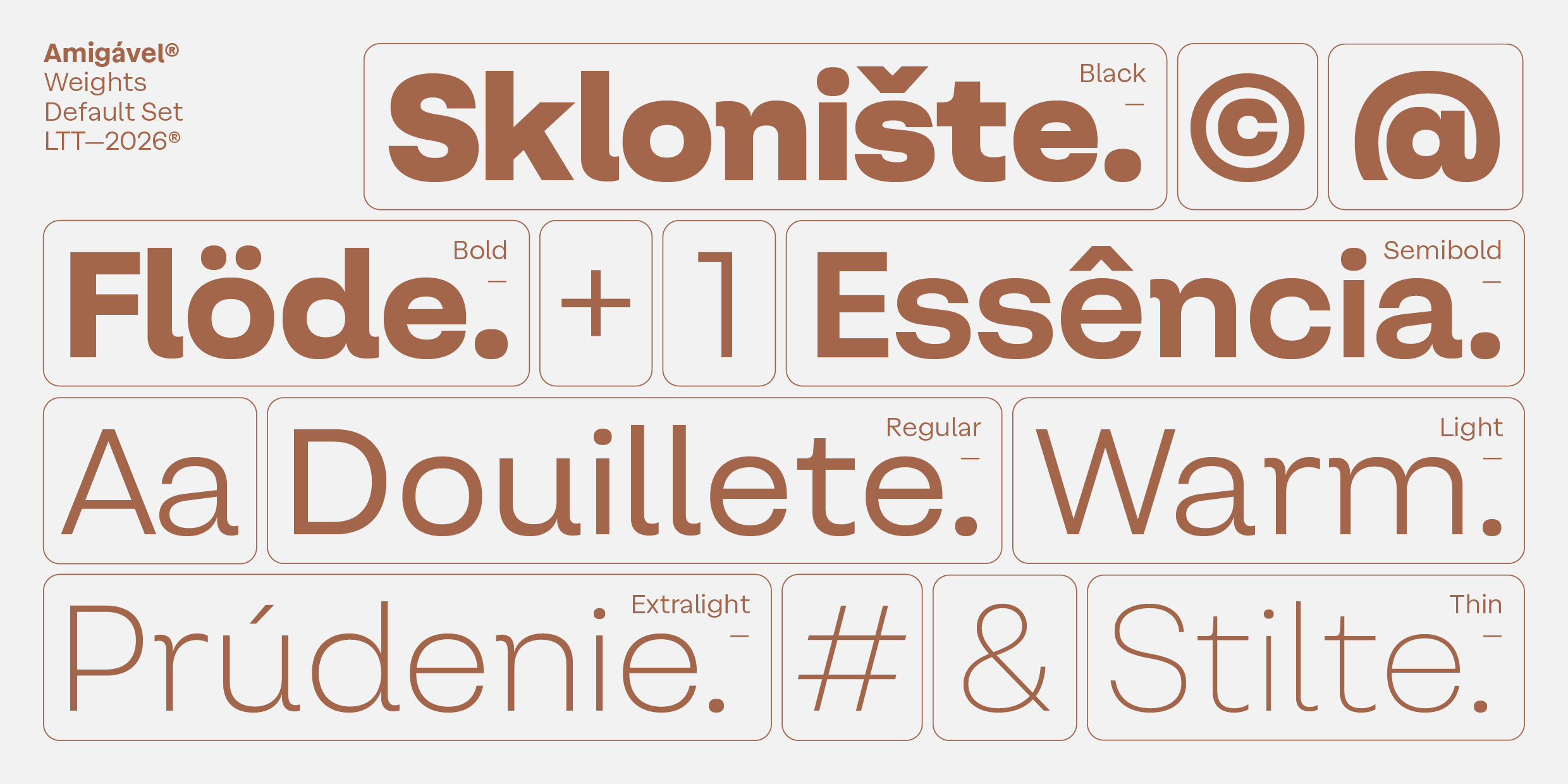
The family includes seven weights, matching italics, and a Variable Font — a complete system for projects that demand both range and consistency.
Precise geometry. Friendly character.